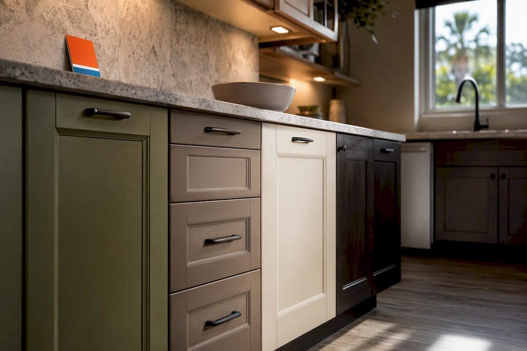
Natural wood finishes now slightly edge out white among renovating homeowners, with earthy greens, warm neutrals, dark charcoal blues, and rich browns rounding out 2026's leading directions. This isn't a rejection of white cabinets so much as a shift toward warmth and texture. We'll walk through each trend, how to pick the right one for your kitchen, and how to test it before committing.
TL;DR:
- Natural wood cabinets are preferred for their warmth and texture, with light and medium tones dominating over dark walnut stains in 2026.
- Earthy greens are replacing sage, used sparingly on islands or lower cabinets and tested in the kitchen to account for lighting variability before committing.
- Warm neutrals like greige, mushroom, and khaki are gaining popularity for resale value, with careful consideration of undertones and pairing options.
- Dark grayer blues and charcoal tones are trending, best balanced with light surfaces and appropriate hardware to prevent a heavy or closed-in feeling.
- Proper surface preparation and sampling are essential for lasting cabinet paint, with professional refinishing preferred over DIY to ensure durability and consistent color matching.
Table of Contents
- Why Natural Wood Cabinets Are Making a Comeback in 2026
- Earthy Greens Are Replacing Sage in 2026 Kitchens
- Warm Neutrals: Greige, Mushroom, and Khaki Take Over From Stark White
- Dark Blues and Charcoal Blues for a Sophisticated Look
- Rich Browns, Espresso, and Terracotta Accents
- Two-Tone Kitchens: Islands and Contrast Cabinetry
- How to Choose the Right Cabinet Color for Your Kitchen
- Painted Cabinets vs. Stained Wood vs. Veneer: What Lasts
- Testing Your Cabinet Color Before You Commit
- Why Homeowners Hire a Pro for Cabinet Color and Finish Work
- Pairing Trending Cabinet Colors With Countertops and Backsplashes
- How Natural and Artificial Light Change the Way Cabinet Colors Look
- The Emotional Effect of Cabinet Color on Kitchen Mood
- The 2026 Kitchen Color Trends Worth Taking Seriously
- Tru Painting: Cabinet Refinishing Done Right for Your 2026 Remodel
- Sources
Why Natural Wood Cabinets Are Making a Comeback in 2026
The wood-versus-white shift isn't dramatic, but it's real, and it signals a broader move away from the all-white kitchens that dominated the last decade. Within the wood category, light and medium tones lead the pack, not the dark walnut stains popular a few years back.
Common choices we're seeing in 2026 remodels:
- White oak with a clear or lightly tinted finish
- Light oak with a matte topcoat
- Rift-cut white oak on islands for a linear grain pattern
Homeowners are choosing where to apply wood carefully. Full-kitchen wood can feel heavy in smaller spaces, so many go with wood on lower cabinets or the island and pair it with painted or white uppers. Wood tones read best against quartz or honed marble countertops, brushed brass or matte black hardware, and warm-toned wide-plank flooring. Under warm LED lighting, light oak looks golden and inviting; under cooler bulbs, it can shift gray.
Earthy Greens Are Replacing Sage in 2026 Kitchens
Sage green had its moment, but designers are now leaning into muddier, olive-leaning greens like smoky jade and forest tones with more gray or brown mixed in. NKBA's 2026 research names green one of the predominant kitchen tones of the year, part of a broader nature-inspired shift.
These earthy greens work best in controlled doses rather than covering every cabinet in the room.
- Islands and lower cabinet runs, paired with cream or white uppers
- Pantry walls or a single wall of built-ins as a focal point
- Paired with unlacquered brass or warm bronze hardware
- Balanced with honed limestone or warm quartzite countertops
Test olive greens in your actual kitchen before you buy a gallon. Under bright north-facing light, muddy greens can read almost gray; under warm afternoon sun, they'll pull more brown and gold. That variability is exactly why designers push sampling over guessing from a paint chip.
Warm Neutrals: Greige, Mushroom, and Khaki Take Over From Stark White
Stark white and cool gray are losing ground to a family of warmer neutrals: greige, mushroom, khaki, and creamy off-whites with a hint of yellow or brown undertone. Designers describe mushroom and warm greige as giving homeowners the neutrality they want without the sterile feel of cool gray.
These shades earn their popularity through resale performance as much as style. Warm neutrals and natural wood are considered safer bets for resale-oriented projects, since they read as updated without alienating buyers who might dislike a bold color.
Shade selection guidance worth following:
- Check undertones under your kitchen's actual light, not the paint store's fluorescents
- Mushroom and khaki lean warmer and pair well with wood and brass
- Greige with a cooler base suits kitchens with lots of natural stone or steel appliances
- Avoid pure white trim next to a warm neutral cabinet, it can make the cabinet look dingy by contrast
Dark Blues and Charcoal Blues for a Sophisticated Look
Bright navy is giving way to deeper, grayer charcoal blues in 2026, a shift NKBA's research also flags as part of the broader move toward earthy, muted tones instead of saturated primary colors. Charcoal blue reads as elegant rather than heavy when it's balanced with enough light surface area elsewhere in the room.
Pairing choices that keep dark blue from overwhelming a kitchen:
- White or light quartz countertops to offset the depth of the cabinet color
- Brushed nickel or aged brass hardware, both work depending on the room's other metals
- A lighter tile backsplash to break up the visual weight
- Under-cabinet lighting to prevent the blue from reading almost black at night
Dark blue tips toward heavy when a kitchen has low ceilings, minimal natural light, and no light-colored surfaces to balance it. In a bright kitchen with generous windows, that same color feels rich rather than closed in.
Rich Browns, Espresso, and Terracotta Accents
Warm brown and espresso tones are returning as a grounded alternative to both stark white and painted color, often used on islands or lower cabinets within a layered palette. Burgundy and terracotta show up more as accent directions than whole-kitchen commitments, giving a traditional kitchen some warmth without the risk of a fully saturated color scheme.
Where these tones land in real kitchens:
- Espresso lower cabinets under white oak or cream uppers
- A terracotta pantry door or single accent wall of cabinetry
- Burgundy paired sparingly with black hardware for a moody, traditional feel
- Warm brown stain on an island surrounded by painted perimeter cabinets
Hardware matters more with these tones than with neutrals. Aged brass and oil-rubbed bronze both complement brown and terracotta, while chrome or polished nickel tends to look cold against them.
Two-Tone Kitchens: Islands and Contrast Cabinetry
Two-tone schemes remain one of the most practical ways to bring 2026's trending colors into a kitchen without repainting every cabinet in the room. Two-tone pairings commonly put a lighter tone on the uppers and a bolder, darker tone on the island or lower run.
- Wood plus painted perimeter. White oak or light wood on the island, painted cream or greige on the surrounding cabinets, a low-risk way to add texture.
- Warm neutral with a dark base. Mushroom or khaki uppers over charcoal blue or espresso lowers, a classic contrast that reads as intentional rather than mismatched.
- Green island with cream uppers. Olive or forest green concentrated on one piece of furniture, keeping the bolder color contained.
Two-tone works because it lets you commit to a trend color on one element, usually the island, while keeping the rest of the kitchen neutral enough to age well. Watch scale: a small kitchen with a tiny island can look chopped up if the contrast is too sharp, so keep the darker tone on the largest single element in the room, not scattered across several small ones.
How to Choose the Right Cabinet Color for Your Kitchen
Picking among these directions comes down to four practical factors: light, size, architectural style, and how your household actually lives in the space.
Start with light. A kitchen with limited natural light handles warm neutrals, light wood, and cream tones far better than it handles charcoal blue or espresso, which can make a dim room feel smaller. South and west-facing kitchens with abundant sun have more room to experiment with darker, richer colors since they won't read as flat or heavy.
Size matters just as much. Smaller kitchens generally read better with lighter cabinetry overall, reserving bold color for an island or a single wall rather than every surface. Larger kitchens with more square footage can absorb a full run of dark blue or espresso without feeling closed in.
Architectural style should guide the finish as much as the color. A farmhouse or cottage-style kitchen leans naturally into warm neutrals and wood; a modern kitchen with clean lines suits charcoal blue or a matte olive green; a traditional kitchen with detailed millwork often carries burgundy or espresso well.
If resale value is on your mind, the data leans toward caution. Warm off-whites and natural wood carry broader buyer appeal than saturated colors, since they don't require the next owner to repaint before they can picture themselves in the space.
Questions worth asking any contractor or designer before you commit:
- What's the realistic timeline for painting versus refinishing my existing cabinets?
- What sheen do you recommend for a kitchen with kids or heavy daily use?
- How will this color and finish hold up to grease and daily cleaning over five years?
- Should I test this on a sample panel before we order paint for the whole kitchen?
Pro Tip: If you're drawn to a bold color like charcoal blue or terracotta but nervous about committing, apply it to the island or lower cabinets only. It gives you the visual impact without turning the whole room into a decision you can't undo cheaply.
Painted Cabinets vs. Stained Wood vs. Veneer: What Lasts
The color you pick only looks good long term if the finish underneath it holds up. Painted cabinets, typically finished with a catalyzed or waterborne enamel, offer the widest color range and a durable, cleanable surface when applied correctly, though sheen choice matters. Satin and low-sheen finishes hide daily wear better than high gloss, which shows every fingerprint and ding.
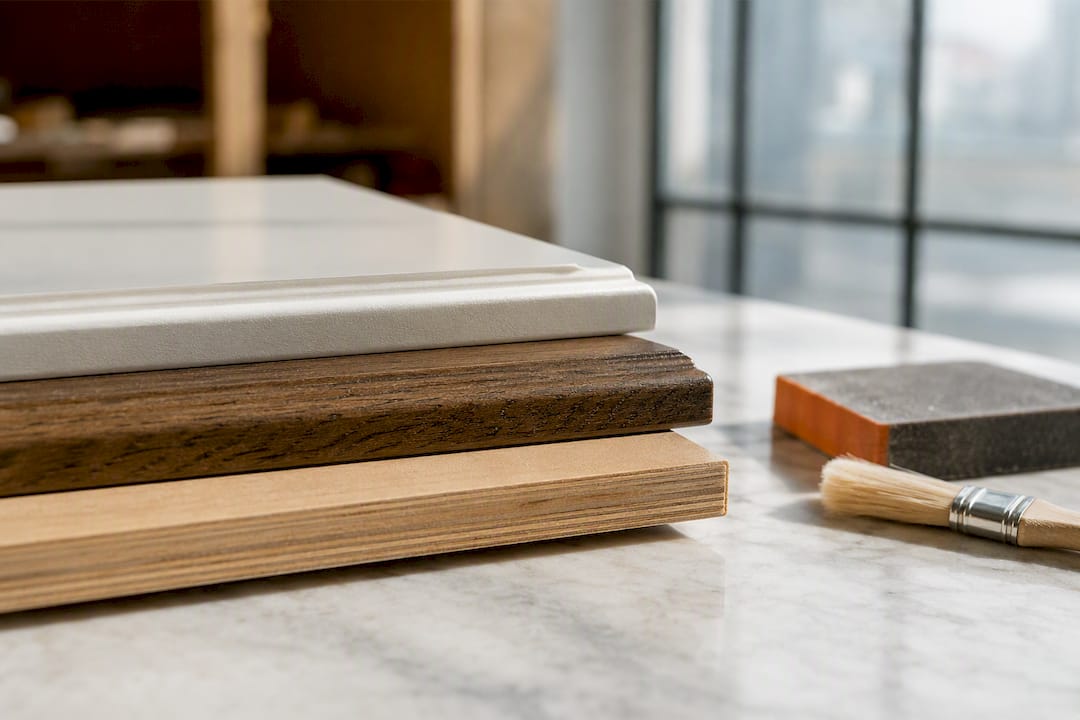
Stained wood, by contrast, changes character depending on the clearcoat used. A matte or satin clearcoat over white oak keeps the wood looking natural and slightly muted, while a glossier topcoat deepens the color and adds shine that can read more formal.
Deciding between refinishing and replacing usually comes down to the condition of the boxes themselves:
- Solid wood cabinets in good structural shape are almost always worth refinishing rather than replacing
- Cabinets with water damage, warping, or failing joints may need replacement regardless of color goals
- Veneer cabinets can be refinished if the veneer itself isn't peeling or bubbling
- Refinishing typically costs a fraction of full replacement and takes days, not weeks
Maintenance expectations differ too. A well-applied paint system on properly prepped cabinets can look sharp for many years with normal cleaning, while unsealed or poorly prepped stain jobs tend to show wear faster around handles and edges.
Testing Your Cabinet Color Before You Commit
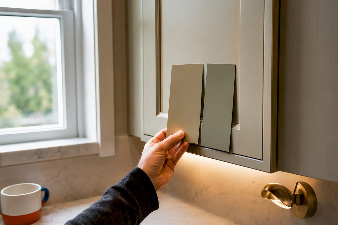
Never choose a cabinet color from a small paint chip alone. Designers recommend testing large painted panels, not just swatches, and viewing them at different times of day before finalizing anything.
- Paint a sample on a large board or actual cabinet door, not a 4x4 inch chip.
- View the sample in your kitchen at morning, midday, and evening light.
- Check how the sheen interacts with your under-cabinet and overhead lighting.
- Hold the sample next to your countertop and backsplash material to spot clashes.
Pro Tip: Ask your painter to prime the sample the same way they'll prime your actual cabinets. Unprimed samples often show a slightly different, more saturated color than the finished product.
Why Homeowners Hire a Pro for Cabinet Color and Finish Work
Cabinet color only looks as good as the prep underneath it. Sanding, degreasing, and priming determine whether paint adheres and resists chipping around handles and hinges, and skipping steps there is the most common reason a fresh cabinet color fails within a year.
A professional refinishing job typically includes surface prep, primer matched to the substrate, and two or more coats of a durable topcoat, all applied in a controlled sequence that's hard to replicate with a weekend DIY project. Color matching across dozens of doors and drawer fronts also takes a trained eye, since slight batch variations in paint can show up under kitchen lighting. If you're weighing a color change against your existing cabinet condition, a professional cabinet refinishing consultation can tell you quickly whether refinishing or replacement makes more sense.
Pairing Trending Cabinet Colors With Countertops and Backsplashes
The cabinet color rarely stands alone. White oak cabinets pair naturally with white or light gray quartz countertops and a simple subway tile or handmade zellige backsplash in a warm cream. Olive green cabinets look best against honed quartzite or warm-toned marble, with a backsplash in unglazed terracotta tile or a soft cream mosaic to keep the green from feeling too dominant.
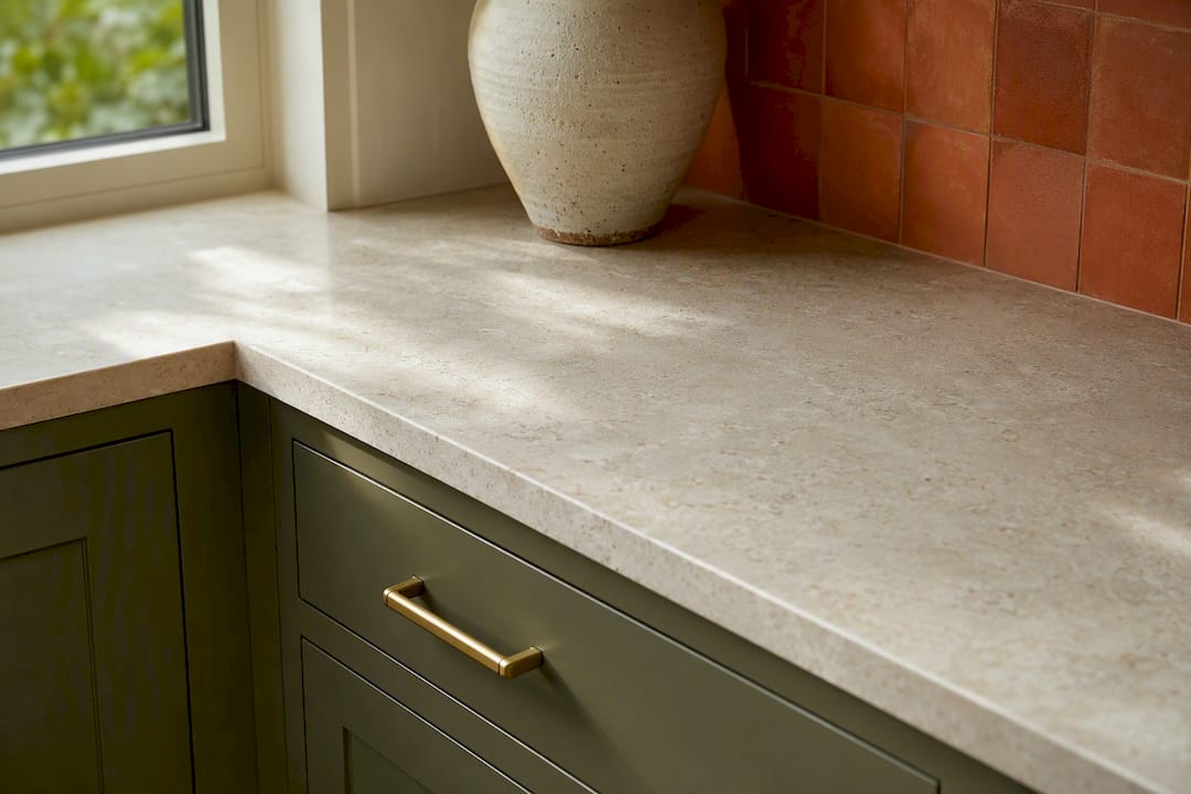
Warm neutrals like mushroom and greige give you the most flexibility. They work with nearly any countertop, from white quartz to darker soapstone, and let the backsplash carry more personality, whether that's a bold tile pattern or a textured natural stone. Charcoal blue cabinets tend to look sharpest with white or light gray countertops and a backsplash that stays simple, since the cabinet color is already doing the visual work.
Espresso and terracotta tones do well with warm white countertops and a backsplash in a complementary earth tone, avoiding cool grays that can make the whole palette feel disjointed. If you're also repainting walls, trim, or doors elsewhere in the kitchen, coordinating those interior color choices with your cabinet direction keeps the whole room feeling intentional rather than assembled piecemeal. The safest approach for resale is picking a neutral cabinet with a countertop that has some movement or pattern, letting one element carry visual interest while the other stays calm.
How Natural and Artificial Light Change the Way Cabinet Colors Look
The same paint chip can look like two different colors depending on your kitchen's light source, which is why so many homeowners end up disappointed after choosing a color from a showroom or a photo online. North-facing kitchens get cooler, bluer natural light, which can make warm neutrals look slightly gray and can push greens toward a colder, more muted tone. South-facing kitchens get warmer light that intensifies yellows, oranges, and browns, making espresso and terracotta look richer but also making some off-whites look more yellow than intended.
Artificial lighting adds another layer. LED bulbs rated around 2700K read warm and will flatter wood tones and warm neutrals, while bulbs closer to 4000K or 5000K read cooler and can make the same cabinet look almost gray by comparison. Under-cabinet lighting placed directly against a dark color like charcoal blue or espresso can wash out the depth of the color at night, making it look flatter than it does during the day.
This is why sampling in your own kitchen, under your own bulbs, at different times of day matters more than trusting a paint swatch under store lighting. A color that looks perfect in a bright showroom can shift noticeably once it's on your actual cabinets, especially if your kitchen has mixed light sources like a window on one wall and recessed lighting overhead.
The Emotional Effect of Cabinet Color on Kitchen Mood
Cabinet color does more than set a style, it shapes how a kitchen feels to spend time in every day. Warm neutrals and light wood tend to create a calm, welcoming feeling that suits kitchens used for gathering and slow mornings, which helps explain why they've become the safer, broadly liked choice for resale.
Earthy greens tend to feel grounding and organic, especially when paired with natural materials like stone or brass, and they suit households that want the kitchen to feel connected to the outdoors. Charcoal blue and dark, saturated colors create a more dramatic, cozy atmosphere, often favored in kitchens used more for entertaining in the evening than bright morning activity. Rich browns and espresso tend to read as warm and traditional, giving a room a settled, established feeling rather than a stark, modern one.
There's no universally "correct" mood to aim for, but it's worth being honest about how you actually use your kitchen before committing to a color that photographs well but doesn't match your daily routine. A household that lives in a bright, high-energy kitchen every morning may find a heavy dark color feels moodier than expected once it's on every cabinet rather than in a single photo.
The 2026 Kitchen Color Trends Worth Taking Seriously
Most of what gets called a "trend" in kitchen design is really just a repackaged version of what came before, but the wood-over-white shift this year is genuinely different. It reflects renovators choosing texture and warmth over the flat, resale-safe white that dominated for over a decade, and the data backs that up rather than just design blogs saying so.
Where I think the conventional advice falls short is the obsession with picking one color for the whole kitchen. The two-tone approach isn't just a trend, it's the smartest way to test a bold direction like olive green or charcoal blue without betting the whole renovation on it. If you're unsure, put the trend color on the island and keep the perimeter neutral.
Prioritize your actual light and how you use the room over what looks best in a single styled photo. A color that reads beautifully in a magazine spread under professional lighting can feel completely different at 7 a.m. under your own kitchen's fluorescent bulbs. Sample first, always.
— Kyle
Tru Painting: Cabinet Refinishing Done Right for Your 2026 Remodel
Choosing the right color is only half the job, getting it applied correctly is what makes it last. Professional cabinet refinishing services offer three service tiers allowing customers to choose the level of prep, priming, and topcoat protection that fits their kitchen and budget.
Every refinishing project ideally starts with proper surface prep and color matching, and preparing a sample panel in your chosen color helps you see it under your own kitchen lighting before committing to the full job. Timelines for cabinet refinishing often take days rather than weeks, since refinishing skips demolition and installation associated with full cabinet replacement. If you're also considering a broader interior refresh alongside your cabinets, our residential interior painting services can be scoped in the same visit.
Ready to see your 2026 cabinet color in person? Request a quote through our cabinet refinishing page and we'll schedule a consult to talk through color, finish, and timeline for your kitchen.
Sources
- The natural wood trend redefining new-build kitchens for 2026 — NewHomeSource
- The NKBA List: Colors of the Year for 2026 — NKBA
- 4 kitchen cabinet paint colors designers are seeing everywhere in 2026 — The Spruce