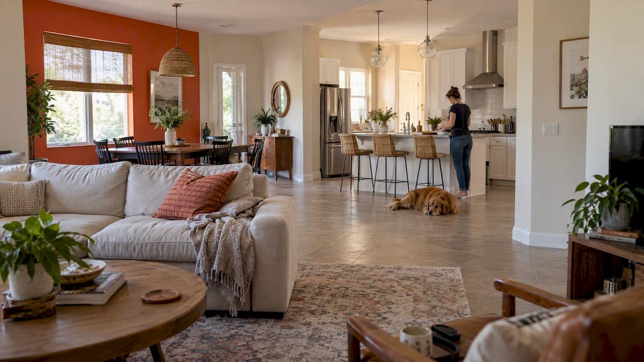
The best open concept paint colors share one thing: they look like they belong together from every spot in the room. In practice that means a warm, light neutral on most walls, a second color used to define zones, and one or two accents that repeat from the kitchen to the living area. Below, we walk through the colors that work, where to change from one shade to the next, and how to test before you buy gallons.
TL;DR
- One color throughout gives a clean, expansive look. A coordinated palette of several colors defines zones without making the space feel choppy.
- Warm whites such as Benjamin Moore Swiss Coffee and Sherwin-Williams Alabaster are safe bases. Soft greens and blues are popular when you want more color.
- Change colors at natural stopping points: inside corners, columns, built-ins and bulkheads. Never stop a color mid-wall.
- Use the 60-30-10 split as a starting point, and test large samples in your own light before committing.
Table of Contents
- One color or several: the first decision
- Neutrals that rarely go wrong
- When you want more than white
- What is replacing gray?
- Let light, floors and fixed features guide you
- Where one color should end and the next begin
- Making separate zones feel like one home
- Using the 60-30-10 rule on your walls
- Test colors the right way
- Sheen matters as much as color
- Our perspective: prep and sequence decide how it looks
- Let us paint your open floor plan
- FAQ
- Sources
One color or several: the first decision
Before you look at a single swatch, decide what you want the space to do. Sherwin-Williams describes both approaches as valid, but for different goals. One color throughout feels clean, expansive and minimalist. A coordinated palette of several colors helps define distinct zones without making the space feel choppy.
One color throughout works best in small spaces, minimalist homes and any house where you want a simple look. It can make the space feel bigger and more connected, according to the same source.
Several colors make sense when your open plan is large, or when the kitchen, dining area and living room each have a different job. You still want the colors to be related. Think of a family of shades rather than a set of strangers.
Neutrals that rarely go wrong
Neutral walls are the most common answer for open layouts, and for good reason. With so many surfaces visible at once (cabinets, flooring, furniture, art), a quiet wall color lets those things do the talking. Warm neutrals also tend to feel cozy rather than clinical.
Two whites come up again and again:
- Benjamin Moore Swiss Coffee (OC-45). Benjamin Moore calls it an essential white with just the right amount of warmth. Its listed light reflectance value (LRV) is 81.91, and it sits in the Off White Collection.
- Sherwin-Williams Alabaster (SW 7008). Sherwin-Williams presents Alabaster as a balanced white with a sleek, modern feel.
Both are soft rather than stark. That matters in an open plan, where a bright, cool white can read as icy once sunlight moves across a big room.
Why not just pick the whitest white?
Because a very bright white magnifies every change in light. In a long room with windows on one end, the far end can look gray or blue by late afternoon. A white with a touch of warmth stays friendlier across the day.
When you want more than white
If you prefer color, keep it soft and related. Sherwin-Williams notes that popular open-concept schemes include nature-inspired soft greens and blues, and warm minimalist soft whites with terracotta or gold accents.
A few ways we would put that to use:
- Muted green on the main walls with warm white trim and wood tones in the floor. It ties the kitchen to a living area that looks out on a lanai or yard.
- Soft blue in a dining or den zone with a warm white in the kitchen. The two feel connected when they share the same undertone.
- A warm neutral with a deeper accent on one feature wall, a pantry door or the back of a bookcase. If you like that idea, our guide to living room accent wall ideas shows how far you can take it.
The pattern is the same each time: a calm base, then color in small, deliberate doses.
What is replacing gray?
If your open plan still has cool gray walls, you are not alone, and the shift away is well documented. Designers in 2025 favored warmer alternatives to millennial gray, including cream, greige, mushroom, warm gray, sage and olive. In the kitchen, the National Kitchen and Bath Association's 2026 trends report, as cited by Better Homes & Gardens, found that 96% of designers expect neutrals such as whites, tans and mocha to lead as the base color family.
Notice what these have in common: warmth. In an open plan, where one color is seen from many angles, that warmth keeps the whole space inviting.
Let light, floors and fixed features guide you
Paint never looks the same on a chip as it does on your wall. Natural light changes how colors look. According to Sherwin-Williams, south-facing rooms can handle cooler colors, while north-facing spaces look better with warmer tones. Open plans often have both: a sunny kitchen on one side and a shadier living area on the other. That is another argument for a warm, balanced base.

Start with what you cannot change
Sherwin-Williams also advises letting fixed elements, such as floors, countertops and cabinets, guide your choices, and considering furniture and decor when you test colors. In a Central Florida home that often means tile or luxury vinyl plank floors, granite or quartz counters and a stucco exterior that sends strong light through the windows. Look at the undertone of those surfaces first. If your floor leans yellow-beige, a pink-leaning or blue-leaning white will fight it.
Use LRV as a tool
Light reflectance value measures how much light a paint color reflects. Sherwin-Williams experts recommend using it to choose colors based on a room's natural light levels. Higher numbers bounce more light. A color in the low 80s, like Swiss Coffee, reflects a lot of light, while mid-tones absorb more and feel deeper and cozier.
Where one color should end and the next begin
The most common open-concept mistake is not the color. It is where the color stops. A shade that ends in the middle of a flat wall looks like a mistake.
Sherwin-Williams recommends natural architectural features such as right-angle corners, columns, built-ins and bulkheads as the places to transition between colors. An inside corner is the cleanest break, because the shadow line hides the change.
A few more habits keep the transitions smooth:
- Check your sightlines. Stand in each room and see what else is visible. The Houzz guide to color flow suggests making sure rooms you can see together work well together.
- Use a neutral as a buffer. Interior designer Gary McBournie advocates a neutral as a palette cleanser between rooms with stronger colors, which helps prevent jarring transitions.
- Keep trim and doors consistent. A neutral color on trim and doors throughout the home can help connect the spaces, as the same Architectural Digest piece notes.
Making separate zones feel like one home
There are a few proven ways to tie zones together without painting everything the same.
- A continuous thread. Designer Lisa Gilmore's "continuous thread theory" uses one color at least once in every room, which creates cohesion without feeling repetitive or overly coordinated, as reported by Houzz.
- Same temperature, different depth. Houzz also points to colors in the same temperature family, or variations of one or two colors.
- Repeated materials. The Studio Matrx color course teaches that repeating the same wood flooring, stone surfaces or metal finishes acts as a subtle color-binding agent.
- Decor and art. Behr suggests that furnishings, decor and artwork are essential for distributing color concentrations, so different rooms can have their own emphasis while staying tied to a shared theme.
The same Studio Matrx source adds that monotony is avoided by using a shared palette in different proportions, rather than painting every surface the same.
Using the 60-30-10 rule on your walls
The 60-30-10 rule is a handy way to keep a palette balanced. Benjamin Moore describes it as 60% dominant color, 30% secondary color and 10% accent. Houzz gives slightly looser ranges: 60 to 70% base, 25 to 30% secondary and 5 to 10% accents, with designer Wardlaw recommending about three colors, four at most, to avoid a chaotic feel.
| Role | Share | In an open plan |
|---|---|---|
| Dominant | 60% | Main walls across the kitchen, dining and living areas |
| Secondary | 30% | A zone wall, cabinetry, a large piece of furniture or rugs |
| Accent | 10% | Pillows, art, a door, one niche or a small feature wall |
Remember that the percentages cover the whole room, not just paint. Your sofa and flooring count toward them. Benjamin Moore also suggests that a whole-house palette ideally has six or seven hues, including a dominant color, secondary colors, a trim color and an accent color. That sounds like a lot, but it includes trim and accents, and many of them are quiet.
A worked example
Picture a great room with the kitchen on the north side and a living area facing south toward a lanai.
- Dominant (60%): a warm white across the main walls, so the whole room reads as one space.
- Secondary (30%): a muted sage on the wall behind the dining table, ending at an inside corner. The kitchen island and wood floors carry the same warmth.
- Accent (10%): terracotta in pillows and a pottery collection, plus a deeper tone on one built-in.
- Trim and doors: the same warm white as the walls, or one step lighter, everywhere.
It is simple, and it holds together from the front door to the back patio.
Test colors the right way
Screens lie. Benjamin Moore's own Swiss Coffee page says screen colors may differ and recommends getting a physical color chip. Go further and test a large sample on the wall.
- Tape up or paint large samples on at least two walls: one that gets direct light and one that stays in shade.
- Look at them in the morning, at midday, in the evening and under your lamps.
- Place them next to your floor, countertop and cabinet colors.
- Live with them for a few days before you decide.
Peel-and-stick samples make this easy. Samplize lists Swiss Coffee, Alabaster and White Dove samples at $6.95 each, made with two coats of real paint, repositionable and shipped overnight. Compare prices at your local paint store as well, since many offer small sample pots.
Sheen matters as much as color
An open plan shows more wall at once, so sheen differences are easy to see. Flat or matte hides imperfections on big walls, while higher sheens in the kitchen are easier to wipe clean. We cover this in detail in our guide to choosing an interior paint finish for every room.
Product details can help you plan. Benjamin Moore lists its Regal Select Waterborne Interior Paint at 400 to 450 square feet of coverage per gallon, with one or two coats recommended and a one-hour dry time. Sherwin-Williams describes Captivate Interior Latex as a paint-and-primer-in-one in Flat, Satin and Semi-Gloss, with VOC below 50 g/L. Open plans often need several gallons, so it is worth thinking about quality. Our piece on where premium paint pays off goes room by room.
Our perspective: prep and sequence decide how it looks
We paint a lot of open layouts in Lake County, and the colors people choose are rarely the problem. The trouble starts when a great color goes onto a wall that was not prepared well, or when the cut lines between two colors are rushed.
Here is what we tell homeowners:
- Pick the base first, then the second color. If you start with the accent, you end up forcing the rest of the room to match it.
- Plan every break point before anyone opens a can. We walk the space with you and mark where each color stops, at corners, columns and built-ins, so the lines look intentional.
- Do not skimp on prep. Patching, sanding, priming and caulking are what make a flawless finish on large wall areas. That is why our three service packages (Cosmetic Refresh, Enhanced Prep & Durability, and Maximum Prep & Protection) differ mainly in how much preparation and protection you want.
- Follow a sequence. Ceilings, walls, trim and doors go in a set order, and an open plan makes that order matter more. Our interior painting sequence guide lays it out step by step.
If you are torn between two colors, choose the warmer, softer one. In our experience, that is the one people are still happy with years later.
— Kyle
Let us paint your open floor plan
A large open space is a big project, and clean lines between colors are where experience shows. Tru Painting is a locally owned painting contractor serving Lake County and Central Florida. We offer residential interior painting with three tiers of service packages, so you can choose the level of prep and protection that fits your home and budget. If your kitchen cabinets need to match the new palette, we also handle cabinet refinishing. Schedule your appointment and we will walk through your space with you.
FAQ
What is the best paint color for an open floor plan?
There is no single answer, but a warm white or light warm neutral is the safest base. Benjamin Moore Swiss Coffee and Sherwin-Williams Alabaster are two popular examples. Test them next to your floors and cabinets, since undertones can change how they look.
Should the whole open concept be one color?
It can be. One color throughout makes the space feel clean, expansive and connected, and it suits smaller or minimalist homes. If your space is large or has distinct zones, a coordinated palette of two or three related colors can define each area without making it feel choppy.
What is the 60-30-10 rule for painting?
It is a balance guide: about 60% dominant color, 30% secondary color and 10% accent. In an open plan, the dominant color usually covers the main walls, the secondary color defines a zone or furniture, and the accent shows up in decor or a small feature.
Where should I stop one paint color and start another?
At a natural break, such as an inside corner, column, built-in or bulkhead. Avoid ending a color in the middle of a flat wall. Keeping trim and doors one consistent neutral also helps the change look intentional.
Can I use dark colors in an open concept space?
Yes, but use them with care. A deep color works well in a defined zone, on a built-in or on a feature wall, with a neutral on the surrounding walls to act as a buffer. Test it in both daylight and lamplight first.
Sources
- How to Paint an Open-Concept Home | Sherwin-Williams
- Swiss Coffee OC-45 | Benjamin Moore
- Alabaster SW 7008 | Sherwin-Williams
- How to Create a Cohesive Color Flow Throughout Your Home | Houzz
- How to Choose Paint Colors for Your Entire House | Architectural Digest
- Whole House Color Schemes | Benjamin Moore
- Choosing a Palette for An Open Floor Plan | Colorfully BEHR
- Flow & Transitions Between Rooms | Studio Matrx
- Samplize samples
- 14 Painting Tricks to Make a Room Look Larger | Better Homes & Gardens
- 2026 kitchen color palette, NKBA | Better Homes & Gardens
- Millennial gray color trend | House Beautiful
- Regal Select Waterborne Interior Paint | Benjamin Moore
- Captivate Interior Latex | Sherwin-Williams